I was tasked to use only the letter L, yet to represent a ligature. By definition a ligature is two letters combined to equal a single glyph. The one I needed to turn in for class is hand lettered (as required), but I prefer this cleaner one.
So this is a sketch I did for my first X-Type idea. Explaining it seems difficult, but it involved Shrinky Dinks, colored pencils, neon pens, secret messages, and a blacklight.
Made this one for a packaging class I had during first year. I decided to do a gum called Spectrum and this is the logotype for it. These are the only letters I did, but I've considered expanding it. Once again, I like angular things.
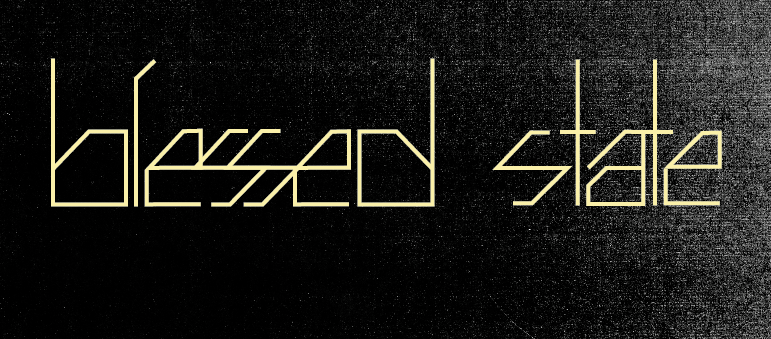
Generally, in the night times when I am watching TV, after having finished my goals in homework, I will doodle in Illustrator. This is a typeface I made last year sometime. I enjoy angular things. Like noses.